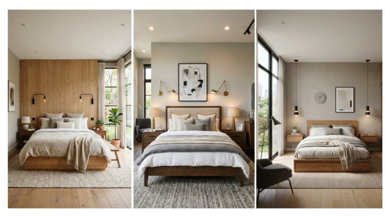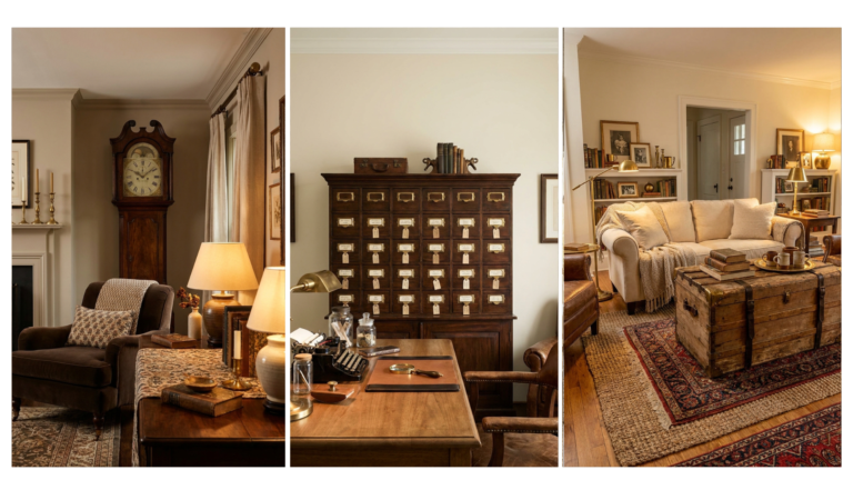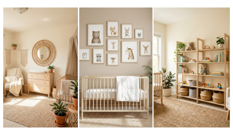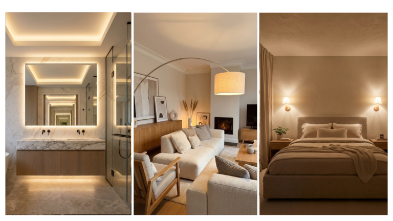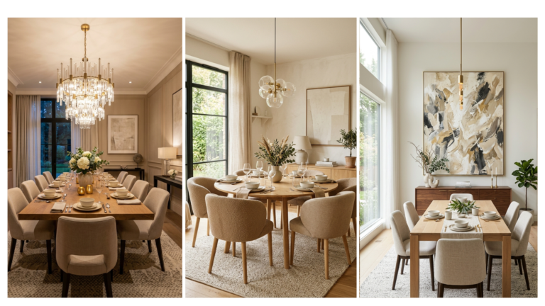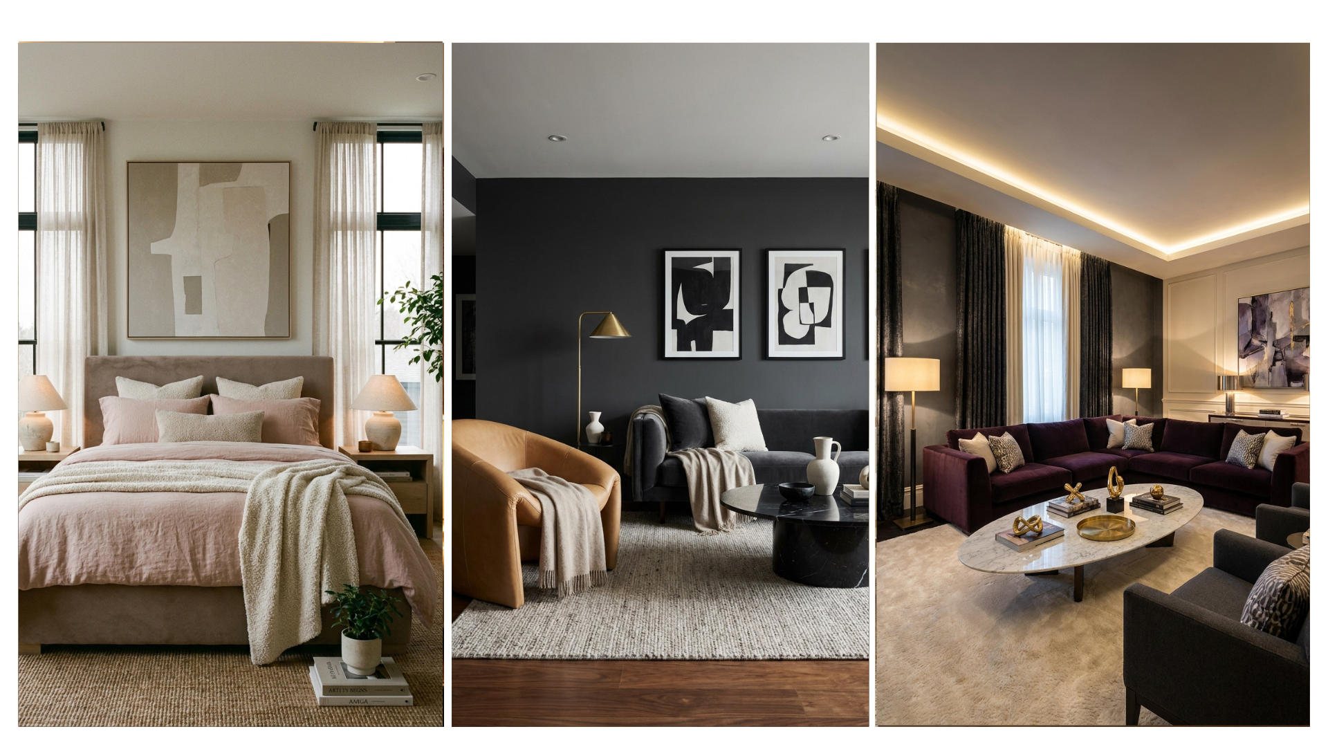
26 Color Palette Ideas That Look Stylish In 2026
A single color choice can completely change how a room feels. The best color palette ideas do more than look beautiful. They help create comfort, balance, personality, and visual flow throughout your home.Many people struggle with choosing colors that work together. A shade may look perfect in a store but feel overwhelming once it reaches the walls, furniture, or decor. That is why thoughtful color planning matters. The right combination can make a small room feel larger, a dark room feel brighter, or a plain space feel more inviting.In this guide, you will discover 26 stylish combinations that are shaping home decor trends in 2026. From warm earthy tones to elegant neutrals and bold modern contrasts, these ideas offer inspiration for every decorating style. Interior designers often use carefully balanced color schemes to create harmony and highlight a room’s best features.In my experience, color has one of the biggest impacts on a room’s atmosphere. I’ve noticed many people benefit from starting with a simple palette and building layers gradually. Whether you are decorating a living room, bedroom, apartment, or entire home, these ideas will help you create a space that feels cohesive, stylish, and uniquely yours.
Neutral Sand Layers
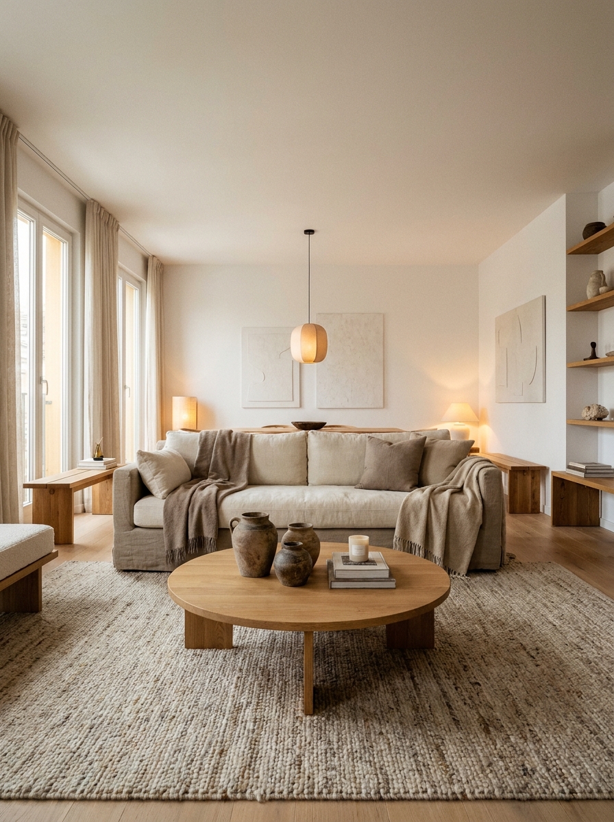
A calm room can instantly feel more expensive with layered sandy tones. This color combination creates softness without looking plain. Warm beige, cream, and taupe work beautifully together in living rooms, bedrooms, and open layouts. Many homeowners choose this approach because it feels timeless. As a result, the space stays stylish even when furniture or seasonal decor changes over time.
- Softens bright interiors
- Creates cozy visual balance
- Works with natural wood
- Supports minimalist styling
- Easy color coordination
Nothing feels more relaxing than a room wrapped in warm neutrals. I’ve noticed sandy palettes photograph beautifully in natural light. That quality makes them popular on Pinterest and in modern homes. The layered shades add depth without strong contrast. Consequently, small rooms appear more open while larger spaces feel welcoming and comfortable throughout every season.
Olive And Clay
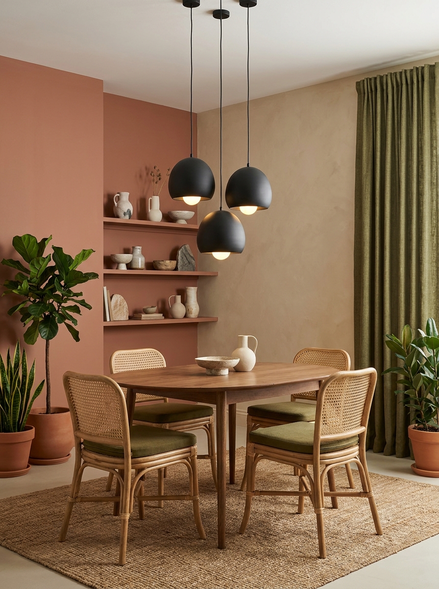
Earthy colors continue gaining attention because they connect interiors with nature. Olive green paired with clay tones creates warmth and personality without overwhelming the room. This palette works especially well in dining spaces, kitchens, and reading corners. The rich combination introduces depth while keeping the environment grounded. Therefore, the room feels stylish, inviting, and easy to decorate.
- Adds organic character
- Enhances natural textures
- Complements wood furniture
- Creates earthy elegance
- Perfect for dining spaces
Rich earth tones often age better than trendy bright colors. In my experience, olive and clay remain attractive through changing design trends. Home stylists frequently use these shades to add warmth without making a room feel dark. The palette also pairs beautifully with woven baskets, linen fabrics, and handcrafted decor pieces for a collected look.
Dusty Blue Blend
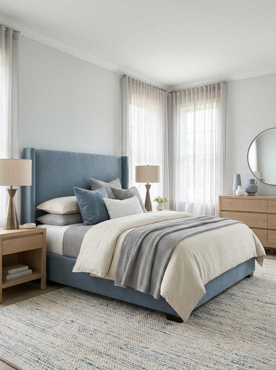
A soothing bedroom often starts with the right color direction. Dusty blue combined with gray and ivory creates a restful atmosphere that feels refined. This palette supports relaxation while still looking stylish. Many designers recommend muted blues because they bring subtle color without visual clutter. As a result, bedrooms feel fresh, balanced, and comfortable every day.
- Encourages restful mood
- Soft visual contrast
- Elegant bedroom styling
- Complements silver accents
- Works year-round
Few color schemes feel as effortlessly calming as muted blue tones. I’ve seen this decor idea transform many rooms beautifully because it balances color and neutrality. The gentle shades pair well with modern and classic furniture alike. Meanwhile, textured bedding and layered fabrics help the palette feel richer and more inviting.
Charcoal And Linen
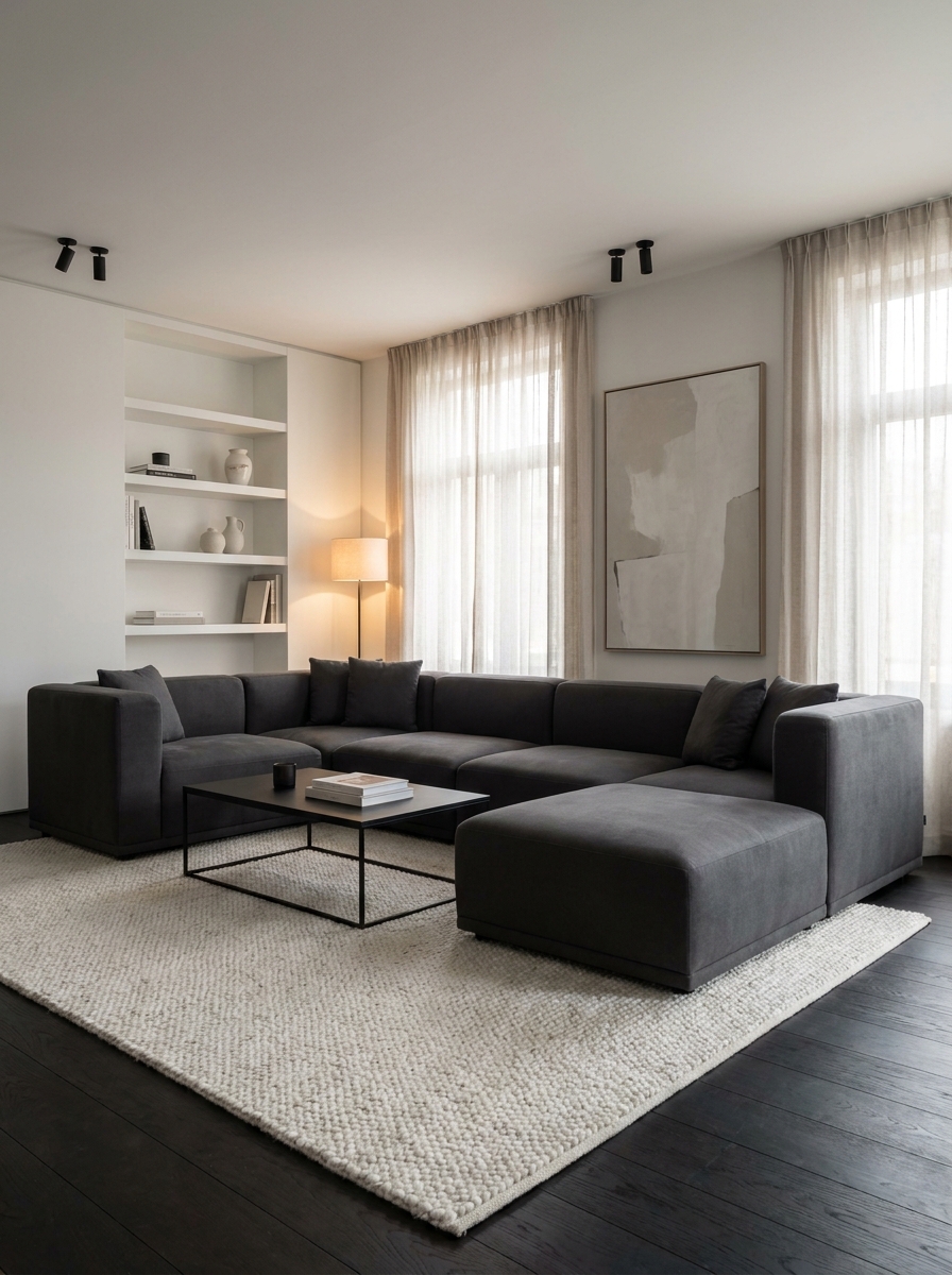
Strong contrast can make an ordinary room feel professionally designed. Charcoal gray and linen white create visual structure while maintaining a clean appearance. This pairing works particularly well in contemporary homes. Dark accents define architectural features, while lighter elements prevent heaviness. Consequently, the room feels polished, organized, and visually striking without excessive decoration.
- Sharp modern contrast
- Highlights architectural details
- Creates sophisticated atmosphere
- Supports minimalist decor
- Balances dark furniture
Bold contrast often delivers impressive results with minimal effort. That’s why many interior designers recommend dark and light combinations. Charcoal grounds the room, while linen tones keep everything bright. The palette works especially well in apartments and modern homes where clean lines and simple styling create the strongest visual impact.
Sage And Cream
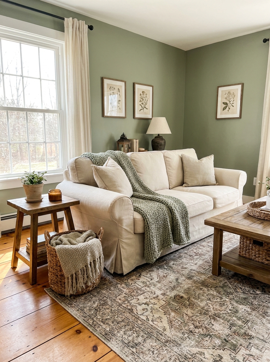
Fresh color choices can make a room feel instantly updated. Sage green and cream create a peaceful atmosphere that suits many decorating styles. This pairing works beautifully in bedrooms, kitchens, and family rooms. The muted green adds gentle character, while cream keeps everything bright. Therefore, the overall look feels balanced and welcoming.
- Adds natural calm
- Brightens cozy spaces
- Works with farmhouse decor
- Complements woven textures
- Timeless color pairing
Nature-inspired shades remain popular because they feel easy to live with. I’ve tried similar combinations in styling projects, and they consistently create a relaxed mood. Soft green tones blend beautifully with wood furniture and neutral textiles. Meanwhile, cream accents reflect light and help rooms feel larger and more comfortable.
Black And Camel
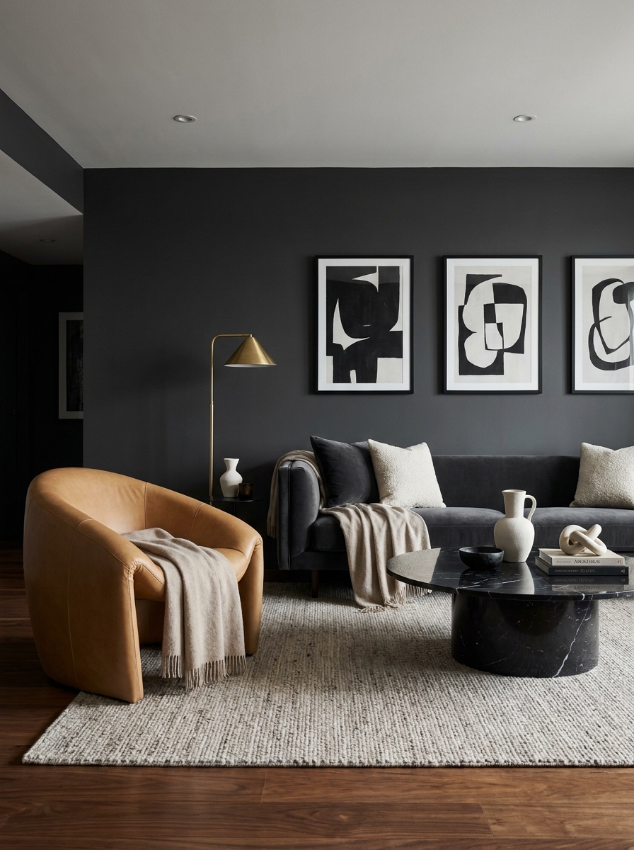
A bold palette can instantly create designer appeal. Black and camel deliver contrast, warmth, and sophistication in one combination. The rich camel tones soften dark accents, making the room feel inviting rather than stark. This pairing works especially well in modern living spaces. As a result, the room gains depth, luxury, and strong visual interest.
- Creates luxury atmosphere
- Adds dramatic contrast
- Enhances modern interiors
- Works with leather accents
- Rich visual depth
Elegant spaces often rely on fewer colors with stronger impact. I’ve noticed black and camel appear frequently in upscale interiors because the combination feels refined. Layering textured fabrics, warm woods, and matte finishes helps this palette feel balanced. The result looks curated, timeless, and effortlessly stylish throughout the year.
Blush And Mushroom
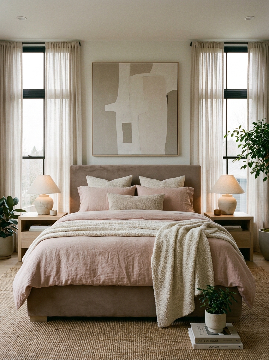
Gentle color combinations can feel surprisingly sophisticated. Blush pink and mushroom taupe create warmth while maintaining a mature look. This palette suits bedrooms, guest rooms, and reading spaces beautifully. The muted pink introduces softness without feeling overwhelming. Meanwhile, taupe grounds the design and keeps the room balanced and elegant.
- Softens modern interiors
- Creates welcoming atmosphere
- Adds subtle warmth
- Perfect for bedrooms
- Enhances layered textiles
Delicate tones often create the most inviting spaces. In my experience, blush works best when paired with earthy neutrals instead of bright white. The combination feels calmer and more refined. Decorative pillows, textured throws, and warm lighting strengthen the effect, creating a room that feels comfortable, stylish, and highly Pinterest-worthy.
Terracotta Sunset
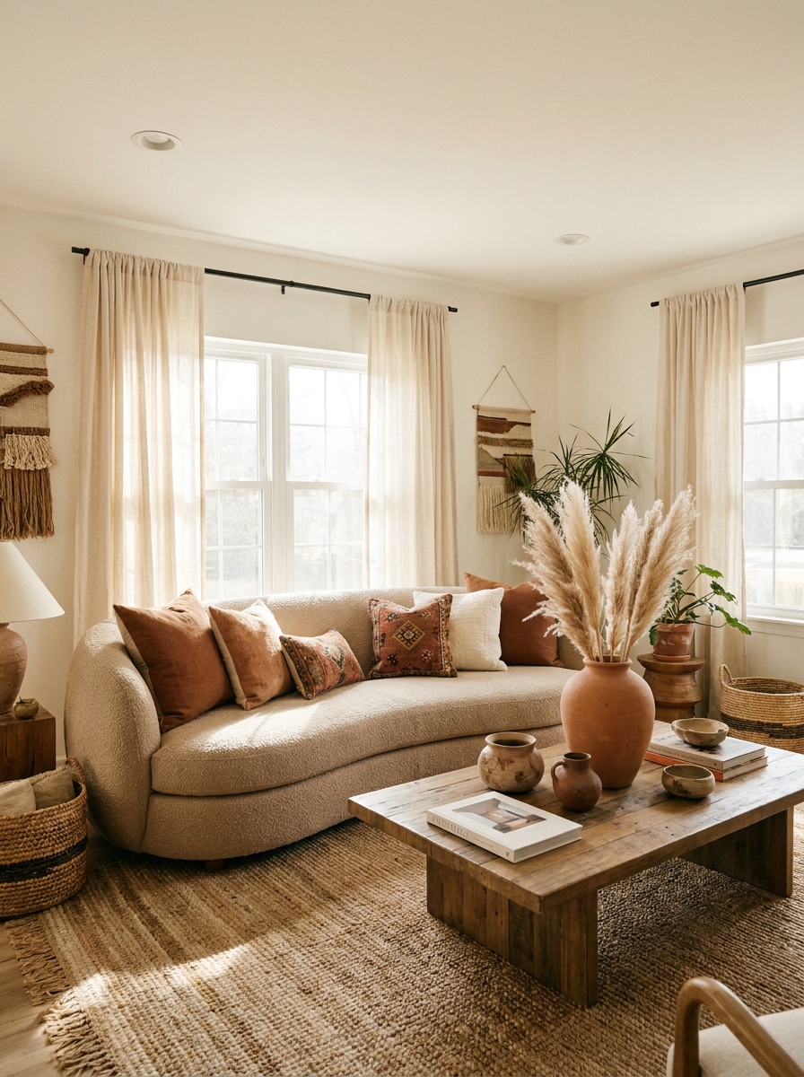
Warm earthy tones instantly create a welcoming atmosphere. Terracotta paired with sandy neutrals brings depth without making a room feel heavy. This palette works especially well in living rooms and open spaces where comfort matters. The rich colors add personality while maintaining a relaxed feel. As a result, the room looks curated, inviting, and full of warmth.
- Adds earthy character
- Creates cozy ambiance
- Enhances natural textures
- Works with boho decor
- Complements wood finishes
Few combinations feel as inviting as warm clay-inspired shades. I’ve noticed terracotta works beautifully with natural materials like linen and oak. The palette creates visual interest without relying on bold patterns. Layered textiles and handmade accessories strengthen the look, helping the room feel collected, stylish, and comfortable every day.
Navy And Ivory
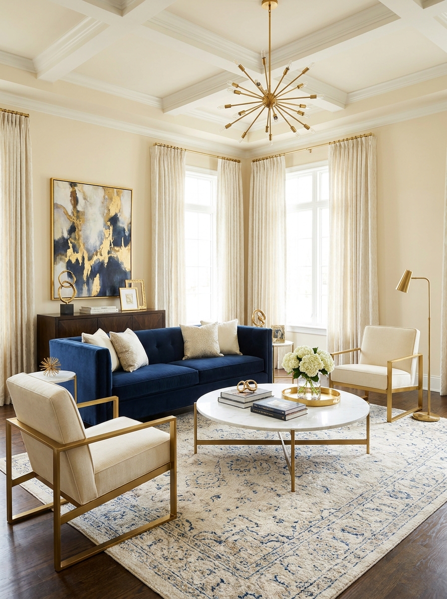
Strong color contrast can make simple spaces feel refined. Navy blue and ivory create a timeless combination that suits both modern and classic homes. The deep blue anchors the room, while ivory keeps everything bright. Consequently, the space feels balanced and sophisticated. This pairing works especially well in living rooms, offices, and formal seating areas.
- Elegant visual contrast
- Brightens dark accents
- Timeless color pairing
- Supports luxury styling
- Ideal for living rooms
A rich navy tone often delivers drama without overwhelming the space. That’s why many designers return to this combination repeatedly. Gold hardware, textured fabrics, and layered lighting make the palette feel even richer. The result is a polished interior that feels both comfortable and impressive.
Mocha Latte Mix
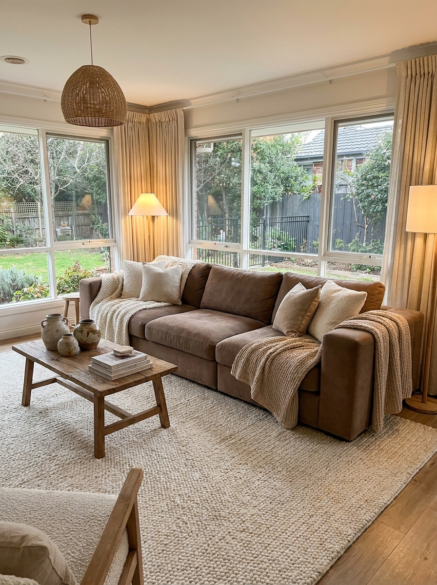
Comfort-focused interiors continue trending because people want relaxing homes. Mocha brown paired with creamy latte shades creates warmth from floor to ceiling. This combination works beautifully in family rooms and cozy lounges. The layered neutrals add richness while remaining versatile. Therefore, decorating becomes easier as furniture and accessories blend naturally into the scheme.
- Adds warmth instantly
- Creates cozy atmosphere
- Supports neutral styling
- Easy furniture matching
- Works year-round
Rich brown tones have returned in a fresh way. I’ve seen many people benefit from using mocha instead of cooler grays. The warmer shades feel more inviting and photograph beautifully. Soft fabrics, warm wood finishes, and cream accents help the palette feel balanced while maintaining a stylish and current appearance.
Forest And Stone
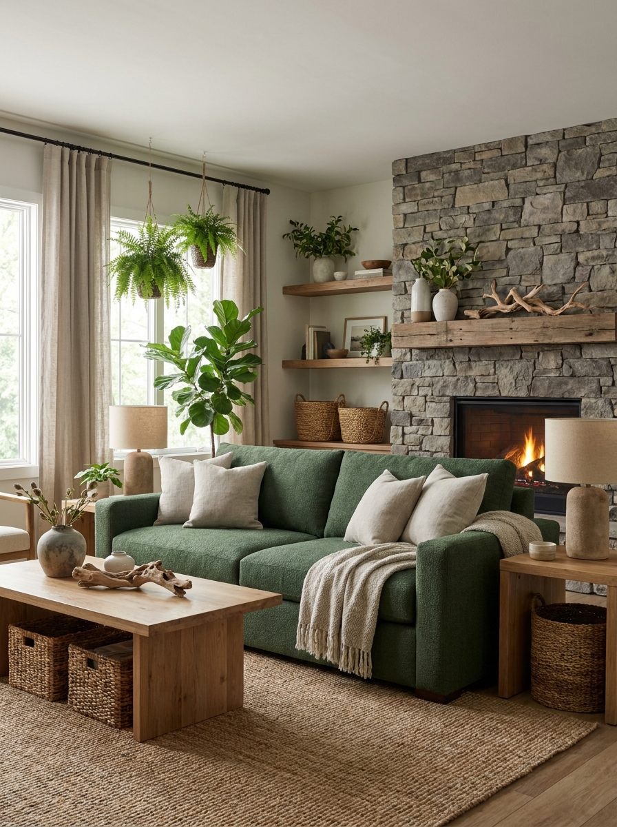
Nature-inspired interiors remain popular because they create a sense of calm. Forest green paired with stone gray feels grounded and sophisticated. The deep green introduces character, while gray balances the palette. As a result, rooms feel connected to nature without appearing rustic. This combination works especially well in living rooms and reading areas.
- Creates natural balance
- Adds rich depth
- Enhances organic decor
- Supports modern rustic style
- Complements stone textures
A strong green shade often makes decorative elements stand out beautifully. In my experience, forest tones work best when layered with lighter neutrals. The contrast keeps the room feeling fresh and open. Natural wood, woven textures, and indoor plants strengthen the look while creating a welcoming atmosphere.
Lavender Mist
Soft color choices can create a surprisingly luxurious feel. Lavender mixed with gray and ivory brings subtle personality without overwhelming a room. This palette works beautifully in bedrooms and guest spaces. The gentle tones encourage relaxation while maintaining elegance. Consequently, the room feels calm, polished, and visually refreshing.
- Encourages relaxation
- Adds subtle color
- Soft bedroom atmosphere
- Elegant visual balance
- Beautiful with ivory accents
Muted lavender has become more versatile than many homeowners expect. I’ve noticed the shade feels sophisticated when paired with warm neutrals. Textured bedding and soft lighting help the palette shine. The overall effect creates a restful environment that feels stylish rather than overly decorative.
Emerald And Brass
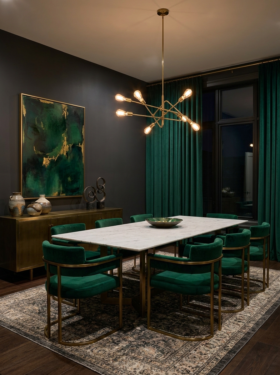
Bold color combinations can create unforgettable interiors. Emerald green and brass introduce richness, depth, and luxury without excessive ornamentation. The jewel tone instantly draws attention, while metallic accents add warmth. Therefore, dining rooms and entertaining spaces feel more memorable. This palette works especially well when paired with textured fabrics and elegant furnishings.
- Creates luxury appeal
- Adds dramatic contrast
- Highlights metallic accents
- Rich dining room style
- Strong visual impact
Many upscale interiors rely on one standout color. That’s why many interior designers recommend emerald as a feature shade. The color pairs beautifully with velvet, marble, and brushed brass finishes. Together, these elements create a sophisticated atmosphere that feels both current and timeless.
Coastal Blue Layers
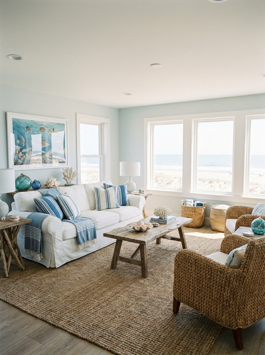
Fresh coastal shades can make a room feel brighter immediately. Layered blues combined with white and sandy beige create an airy atmosphere. This palette suits living rooms, sunrooms, and apartments beautifully. The mix feels relaxed without looking themed. As a result, the room appears open, cheerful, and easy to update throughout the year.
- Brightens small spaces
- Creates airy atmosphere
- Works with coastal decor
- Enhances natural light
- Relaxed everyday style
Nothing feels quite as refreshing as soft blue layers. I’ve tried similar combinations in smaller rooms, and they instantly felt more spacious. Light fabrics, woven textures, and simple accessories help the palette remain balanced. The finished space feels calm, welcoming, and effortlessly stylish.
Greige Harmony
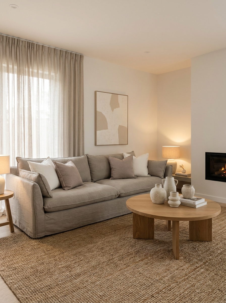
A balanced neutral scheme never goes out of style. Greige blends gray and beige into one versatile foundation that works across many interiors. This palette creates warmth without feeling overly traditional. At the same time, it maintains a clean modern appearance. As a result, homeowners can refresh furniture and accessories without changing the overall design direction.
- Balances warm and cool
- Easy decorating foundation
- Supports minimalist interiors
- Works in every room
- Timeless neutral appeal
Many homeowners struggle between gray and beige tones. I’ve noticed greige solves that problem beautifully. The flexible shade complements natural wood, black accents, and soft textiles. Layering different neutral textures keeps the room visually interesting while preserving a calm and sophisticated atmosphere throughout the year.
Peach And Sand
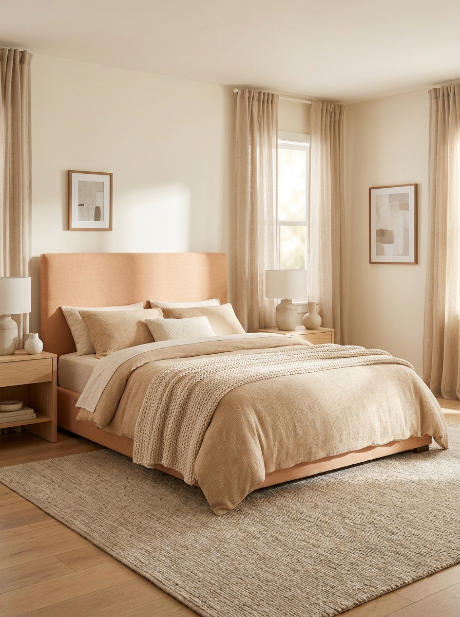
A gentle touch of color can completely refresh a space. Peach paired with sandy neutrals creates warmth while keeping the room bright. The palette feels cheerful without becoming overwhelming. Consequently, bedrooms, nurseries, and reading corners feel more inviting. Soft peach accents also blend beautifully with natural materials and relaxed decor styles.
- Adds subtle warmth
- Brightens neutral rooms
- Creates welcoming atmosphere
- Soft modern aesthetic
- Complements natural textures
Warm peach tones continue gaining attention because they feel approachable and fresh. In my experience, this palette works best with layered fabrics and soft lighting. The gentle contrast creates depth without visual clutter. As a result, the room feels cozy, stylish, and comfortable from morning through evening.
Blackberry Luxe
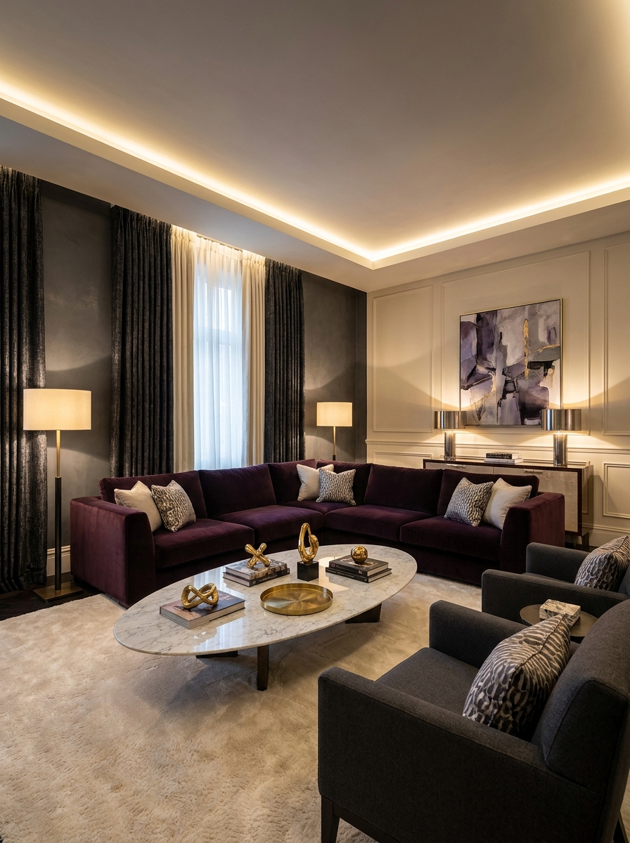
Rich jewel tones create unforgettable interiors when used thoughtfully. Blackberry purple paired with charcoal and cream delivers drama while remaining elegant. The darker shades add depth, while cream prevents the room from feeling heavy. Therefore, living rooms and formal spaces gain a luxurious appearance that feels curated rather than overwhelming.
- Rich luxury atmosphere
- Adds dramatic depth
- Elegant jewel tones
- Strong focal styling
- Sophisticated color contrast
A deep accent color often creates more impact than multiple bright shades. I’ve seen this decor idea transform many rooms beautifully because it introduces personality without clutter. Velvet fabrics, metallic accents, and layered lighting help the palette feel refined. The finished space feels bold, stylish, and memorable.
Buttercream Glow
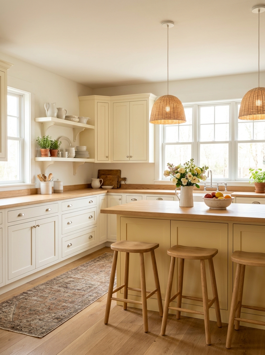
Warm yellow tones can make a home feel brighter instantly. Buttercream paired with white and oak creates a cheerful atmosphere without appearing overly colorful. This palette works especially well in kitchens and breakfast nooks. The soft yellow reflects light beautifully. As a result, the space feels welcoming, fresh, and full of energy.
- Brightens dark rooms
- Creates cheerful mood
- Works in kitchens
- Enhances natural light
- Warm farmhouse charm
Many homeowners want more warmth without bold color choices. That’s why many interior designers recommend muted yellow tones. Buttercream feels softer than traditional yellow while maintaining brightness. Combined with natural wood and white finishes, the palette creates an inviting environment that feels timeless and uplifting.
Slate And Walnut
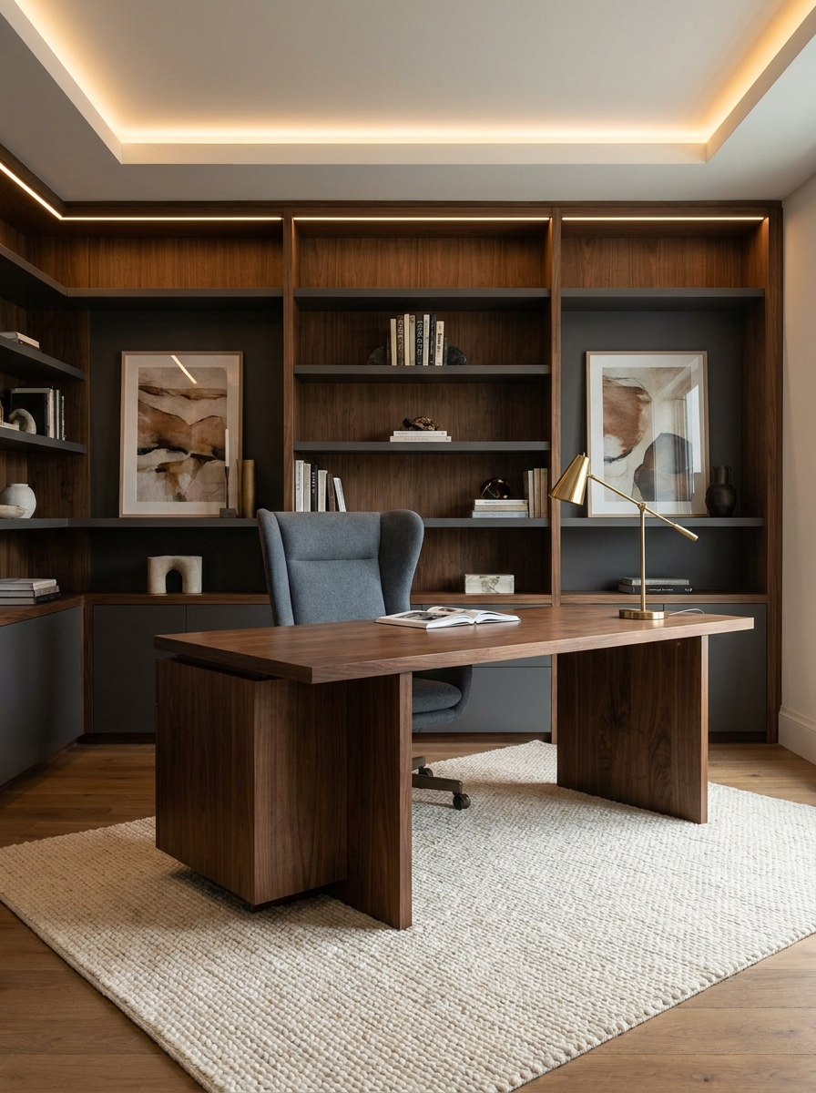
Strong color combinations often create a sense of confidence. Slate gray and walnut brown provide depth while maintaining warmth. This pairing works beautifully in offices, libraries, and modern living rooms. The dark tones establish structure, while lighter accents create balance. Consequently, the room feels polished, productive, and visually grounded.
- Sophisticated modern look
- Rich wood contrast
- Supports office design
- Creates visual depth
- Balanced neutral palette
Dark neutrals remain popular because they feel refined and versatile. I’ve noticed walnut wood softens cooler gray tones exceptionally well. The combination also works with metal finishes and textured fabrics. Together, these elements create an interior that feels professional, welcoming, and easy to style.
Mint And Ivory
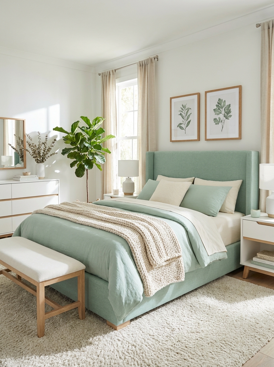
Fresh colors can energize a room without creating visual chaos. Mint green and ivory deliver a light, airy appearance that feels refreshing. The gentle green introduces personality, while ivory keeps everything bright. Therefore, bedrooms, bathrooms, and small apartments often benefit from this uplifting palette.
- Creates airy atmosphere
- Brightens compact rooms
- Refreshing color balance
- Soft modern style
- Pairs with botanicals
Light green shades often make interiors feel cleaner and more open. In my experience, mint works especially well with natural light. Layered textures prevent the room from feeling flat while maintaining simplicity. The overall effect creates a cheerful space that feels comfortable and effortlessly stylish.
Chocolate And Cream
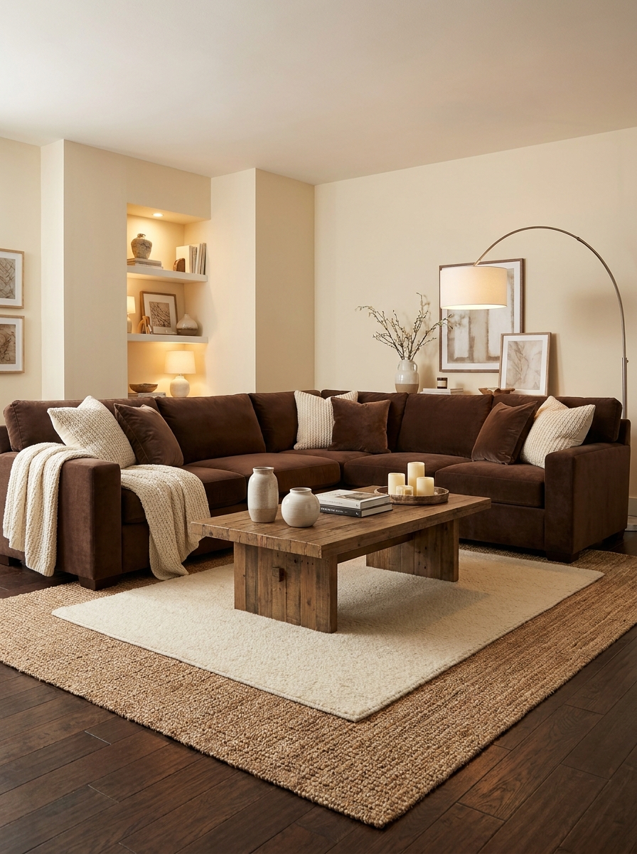
Warm contrast can make a room feel instantly welcoming. Chocolate brown paired with cream creates richness without sacrificing brightness. The darker tones add visual weight, while cream softens the look. As a result, family rooms and living spaces feel comfortable, elegant, and highly livable throughout every season.
- Rich cozy atmosphere
- Strong neutral contrast
- Enhances layered textures
- Comfortable family room style
- Timeless color pairing
Few combinations feel as dependable as brown and cream. I’ve noticed homeowners return to this palette because it feels inviting year after year. Textured fabrics, warm wood accents, and soft lighting strengthen the effect. The finished room feels relaxed, polished, and perfectly suited for everyday living.
Silver Sage Contrast
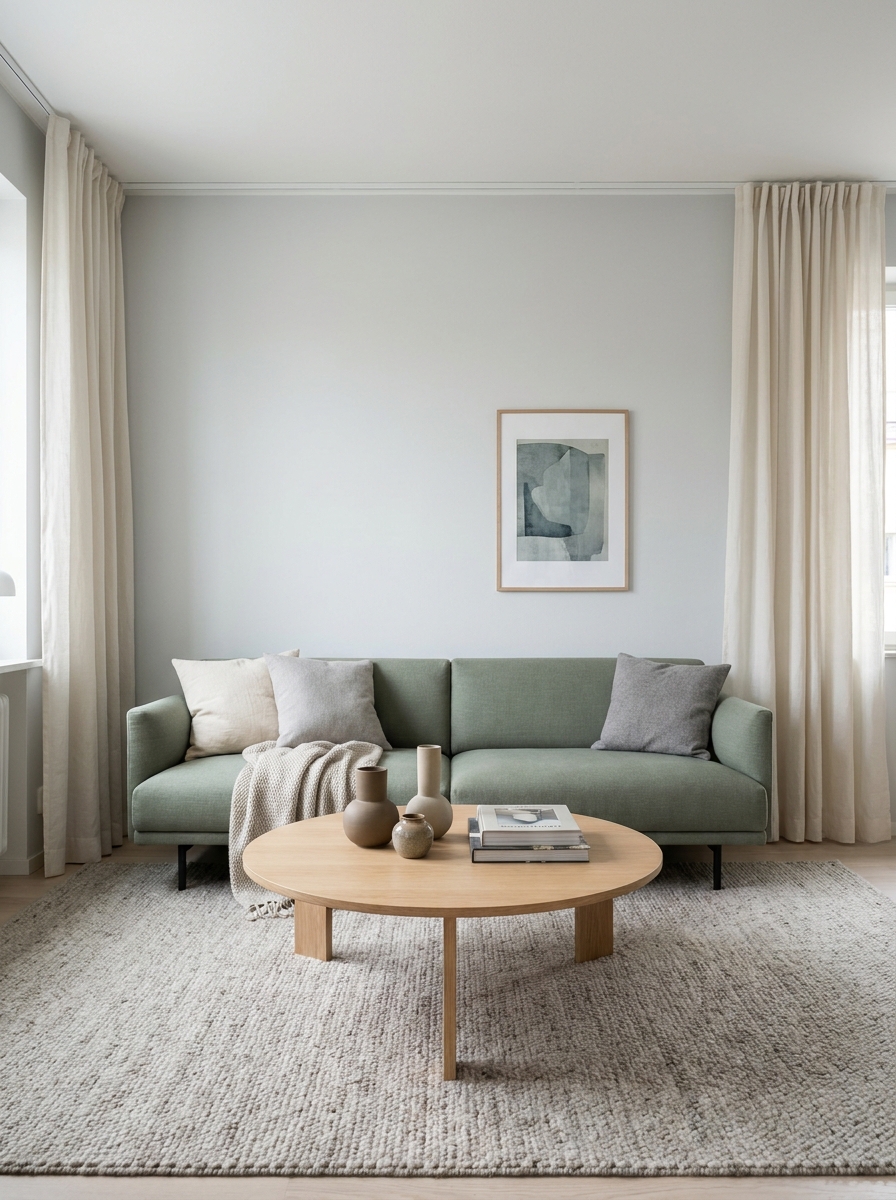
A fresh color refresh does not always require bold shades. Silver sage paired with soft gray and white creates a clean look that feels current and calming. The muted green adds gentle character, while gray tones provide balance. As a result, the room feels sophisticated and welcoming. This combination works beautifully in living rooms, bedrooms, and apartment spaces.
- Soft modern color story
- Creates calm atmosphere
- Complements natural wood
- Brightens everyday spaces
- Easy seasonal styling
Muted greens continue gaining popularity because they feel timeless. I’ve noticed silver sage adapts well to changing decor trends. Decorative pillows, textured throws, and simple artwork fit naturally into this palette. The subtle contrast keeps the room visually interesting while preserving a peaceful and polished appearance throughout the year.
Desert Rose Layers
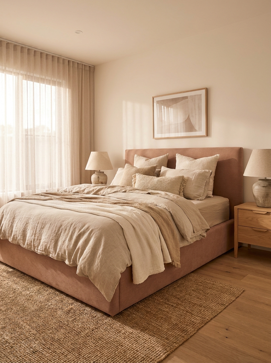
Warm pink tones can feel surprisingly elegant when paired with earthy neutrals. Desert rose introduces softness without appearing overly feminine. Combined with beige and ivory, the palette creates a welcoming atmosphere filled with warmth. Consequently, bedrooms and guest rooms feel more comfortable and visually layered while maintaining a refined and mature appearance.
- Adds gentle warmth
- Elegant soft contrast
- Cozy bedroom styling
- Complements neutral decor
- Pinterest-worthy palette
Many homeowners want color without overwhelming their space. In my experience, desert rose offers the perfect balance. The muted tone works beautifully with natural materials and textured fabrics. Layering different shades within the same family helps the room feel intentional, stylish, and effortlessly coordinated.
Teal And Sandstone
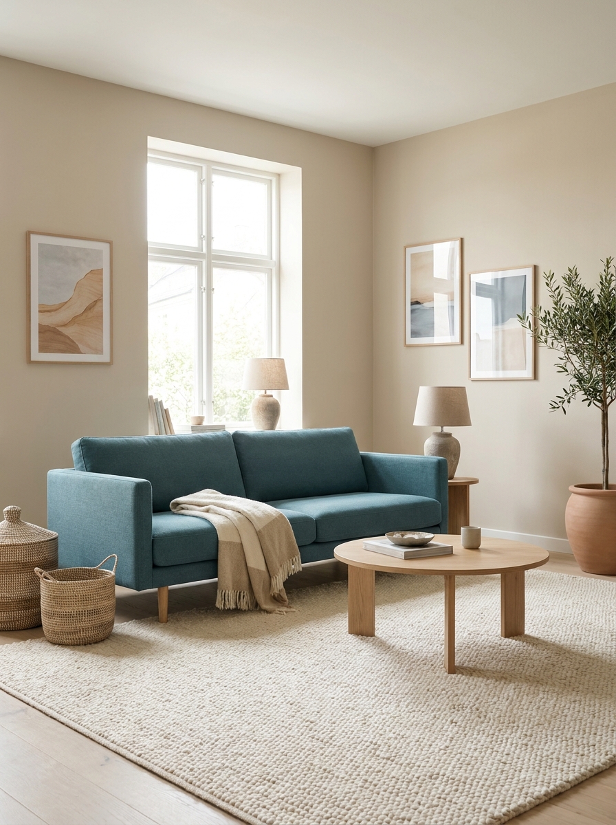
A striking accent color can completely refresh a neutral room. Teal paired with sandstone creates depth while preserving warmth. The blue-green tone draws attention, while beige keeps the palette grounded. Therefore, the space feels energetic yet balanced. This combination works especially well in living rooms, offices, and creative spaces.
- Rich visual contrast
- Adds vibrant personality
- Balances warm neutrals
- Stylish modern appeal
- Strong focal accents
Color pairings often succeed when one shade leads and another supports. I’ve seen this decor idea transform many rooms beautifully because it feels bold without becoming overwhelming. Natural textures and warm lighting help soften the contrast. The result feels contemporary, inviting, and highly memorable.
Warm White Monochrome
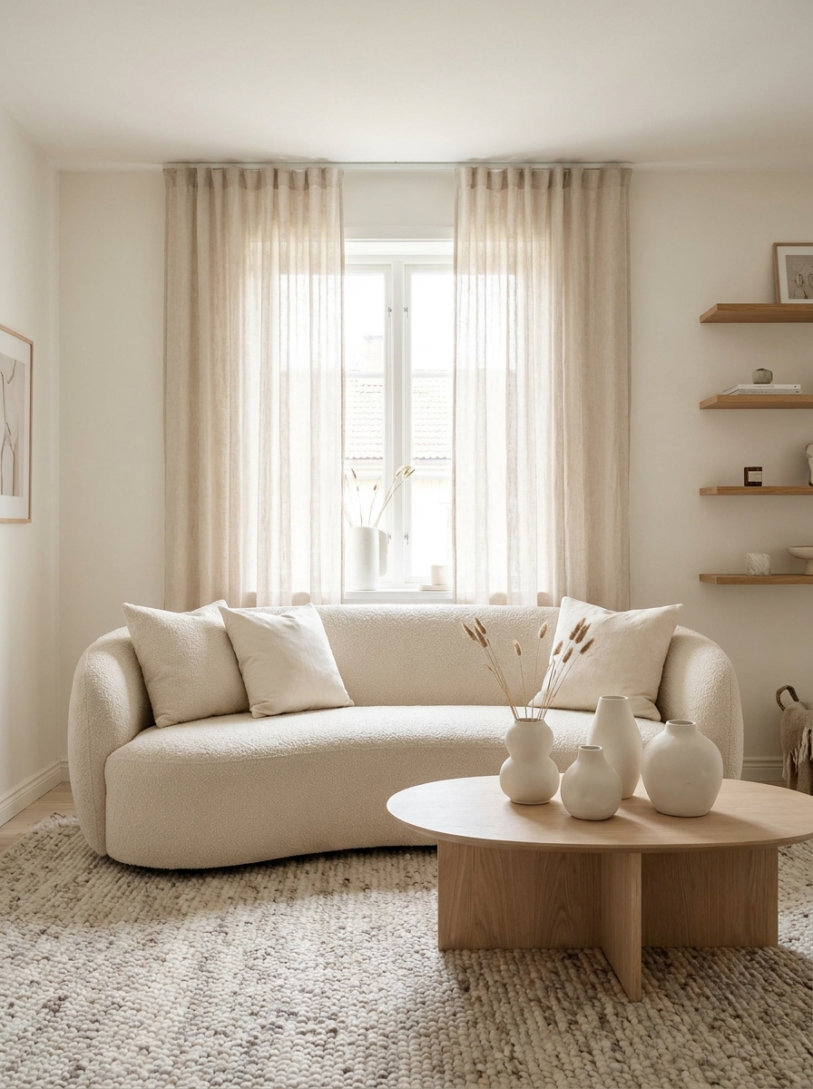
Few decorating approaches feel as timeless as layered whites. Different shades of cream and ivory create depth while maintaining a clean appearance. This approach works especially well in smaller homes because it reflects light beautifully. As a result, rooms appear larger, brighter, and more open without sacrificing warmth or comfort.
- Expands visual space
- Creates airy atmosphere
- Supports minimalist decor
- Reflects natural light
- Timeless neutral style
A monochrome palette succeeds when texture becomes the focus. That’s why many interior designers recommend mixing linen, wool, wood, and ceramic finishes. The variation prevents the room from feeling flat. Instead, the space feels elegant, calming, and thoughtfully designed while remaining incredibly versatile.
Cinnamon And Cream
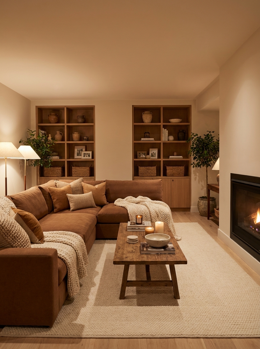
Warm earthy shades continue dominating stylish interiors because they create comfort instantly. Cinnamon brown paired with cream feels rich yet approachable. The warm tones add depth and character without making the room feel dark. Consequently, family rooms, lounges, and reading corners gain a cozy atmosphere that encourages relaxation.
- Creates inviting warmth
- Rich earthy character
- Perfect cozy interiors
- Enhances layered textiles
- Timeless neutral balance
Nothing feels more welcoming than a room wrapped in warm tones. I’ve noticed cinnamon shades work especially well with wood furniture and soft fabrics. The palette feels current while remaining timeless. Decorative accents in cream and caramel complete the look, creating a comfortable space that feels stylish every season.
Conclusion
Beautiful decorating often starts with the right colors. These color palette ideas show how thoughtful combinations can bring warmth, elegance, energy, or calm into any room. Even small updates, such as new textiles, artwork, or accent pieces, can make a noticeable difference when the colors work together.
Save your favorite ideas on Pinterest so you can revisit them during your next decorating project. Try one palette that speaks to your style and build from there. Share this article with friends or family who need fresh inspiration. I’ve seen how the right color combination can completely change a room’s mood, and your perfect home refresh could begin with just one new shade.
Frequently Asked Questions
What is the easiest color palette for beginners?
Neutral combinations are usually the easiest starting point. Warm white, beige, soft gray, and natural wood tones work together effortlessly. These colors create a balanced foundation and allow you to add accent colors gradually without overwhelming the room.
How many colors should a room have?
Most designers recommend three to five colors. A primary color covers most of the room, a secondary color adds depth, and one or two accent shades create contrast. This approach keeps the space coordinated while adding visual interest.
What color palettes are trending in 2026?
Earthy greens, warm browns, muted blues, soft terracotta, creamy neutrals, and sophisticated monochrome schemes are among the biggest home decor trends for 2026. These palettes feel modern while remaining timeless and versatile.
How do I choose colors for a small room?
Lighter shades often make small rooms feel larger and brighter. Soft whites, warm creams, pale greens, and light grays reflect more light. You can still add darker accents through pillows, artwork, or decorative accessories.